December 12th, 2025
Fixed
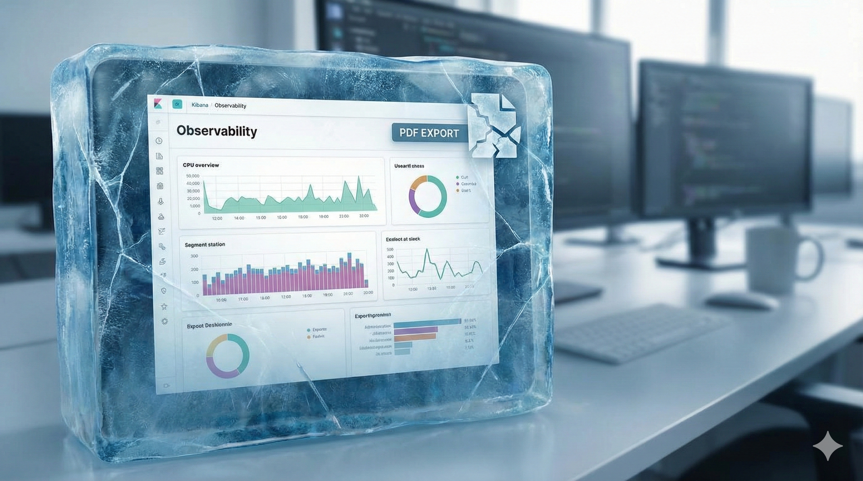
Why Kibana Reporting Fails in the Real World (and How Teams Work Around It)
Kibana reporting is genuinely useful—right up to the moment you rely on it for executive updates, compliance evidence, customer-facing PDFs, or “send this only if something changed.” Then it starts behaving like what it really is: a headless screenshot pipeline bolted onto an interactive UI.
This post isn’t a dunk. It’s a practical map of where Kibana reporting shines, where it predictably breaks, and what teams do when they hit the wall.
What Kibana Reporting actually is (so expectations are accurate)
Kibana’s PDF/PNG reporting is built around rendering what you see on screen into an export. Under the hood, reports are generated on the Kibana server as background jobs coordinated through Elasticsearch documents.
And the rendering itself is based on headless Chromium (Kibana manages Chromium binaries and drives the browser for screenshotting / PDF exports).
This architecture implies two important truths:
Reporting inherits UI fragility. If the UI struggles to render a view reliably, reporting will struggle too.
Reporting is “what’s on the screen,” not “what’s true.” It’s a presentation capture mechanism, not a semantic reporting engine.
That’s fine—until your use case is not a screenshot.
The first failure: reporting is static, but operations are comparative
Most reporting needs are comparative:
“Did error rate change since last week?”
“Is this spike new or just seasonality?”
“Only notify if the KPI moved materially.”
“Send the PDF only if something significant changed.”
Kibana reporting doesn’t have a native concept of diffing between runs, conditional delivery, or “what changed since last export.” It creates a PDF/PNG of the current dashboard state.
Elastic’s own wording around reporting reinforces this “what you see” model: PDF reports are tied directly to what is seen on screen.
Why this matters: In real teams, attention is the scarce resource. Static scheduled PDFs quickly become noise—people stop reading them because they don’t answer the question “why am I being pinged?”
The second failure: large dashboards don’t export cleanly
If your dashboards are small and tidy, Kibana reporting can be smooth. But real dashboards aren’t always small and tidy—especially in mid-market orgs where dashboards become living shared artifacts.
Elastic’s own troubleshooting guidance acknowledges that large pixel counts (big dashboards, lots of panels) can demand more memory/CPU and suggests splitting dashboards into smaller artifacts.
In practice, teams run into:
PDFs with unusable pagination or layout
Panels stretched, clipped, or missing
“For printing” exports that time out or format awkwardly
These aren’t hypothetical. Community reports describe large dashboards producing a single giant unprintable page or poorly paginated PDFs with cut-off / stretched visualizations.
And for truly huge canvases or dashboards, people end up increasing memory and timeouts dramatically and still failing—because you’re essentially asking a headless browser to deterministically render a complex app view into a document.
The third failure: timeouts and “max attempts reached” become your operational burden
When reporting fails, Kibana surfaces errors like “Max attempts reached.” Elastic documents two common causes:
The export spans a large amount of data and Kibana hits
xpack.reporting.queue.timeoutReverse-proxy / server settings are not configured correctly
This reveals a hidden cost: your team becomes the operator of a rendering farm.
Instead of “schedule report,” your backlog becomes:
tuning queue timeouts
tuning capture timeouts
resizing dashboards
splitting dashboards
debugging reverse proxy edge cases
chasing nondeterministic Chromium issues
That’s not reporting. That’s maintaining an internal PDF renderer.
The fourth failure: “reporting” and “alerting” don’t naturally fit together
Kibana alerting is solid for what it’s built to do: create rules against Elasticsearch data and send actions through connectors. Elastic positions it as a consistent interface across use cases, with integrations and scripting available.
But alerting and reporting live in different mental models:
Alerts are about signals: something crossed a threshold, a rule matched, an anomaly score tripped.
Reports are about communication: what changed, what it means, and what to do.
You can send an alert to Slack. You can attach a PDF. But Kibana doesn’t give you a first-class, built-in way to reliably produce human-ready, contextual, change-aware narratives (because its primitives are rules and screenshots).
So teams either:
spam alerts (and burn attention), or
schedule reports (and hope people read them), or
manually add context (and burn engineering time)
The fifth failure: compliance and audit evidence needs “immutability,” not “a screenshot today”
For compliance, the question is rarely “what does the dashboard look like right now?”
It’s:
“What was true on that date?”
“Can you prove it wasn’t tampered with?”
“Can you show consistent evidence collection over time?”
Kibana reporting can generate PDFs, but it’s not designed as a compliance evidence pipeline. If you’re in a regulated environment, you’ll feel the gap quickly: lack of run-to-run comparison, lack of explicit evidence controls, and the ease with which dashboards change after the fact.
(If you’re already collecting screenshots into a GRC folder manually, you know exactly what this costs.)
Common workarounds teams use (and what they cost)
These are the patterns that appear again and again once Kibana reporting doesn’t fit.
1) “Split the dashboard”
This is even recommended in Elastic troubleshooting guidance.
Cost: redesign work and fractured storytelling. People lose the “single pane” view that made the dashboard valuable.
2) “Tune timeouts / memory / reverse proxy”
Elastic explicitly points at timeout settings like xpack.reporting.queue.timeout when exports fail.
Cost: ongoing ops toil. Reporting becomes another service to babysit.
3) “Use Canvas for paginated layouts”
Some teams rebuild reports in Canvas because it gives more control over page-like layouts (and community responses often point users there).
Cost: now you’re maintaining two artifacts: operational dashboards and report layouts.
4) “Write custom Puppeteer scripts”
This works—because Kibana itself uses a headless browser approach.
Cost: brittle scripts, auth headaches, constant UI changes breaking automation.
5) “Buy a reporting add-on”
There’s a whole ecosystem of third-party Kibana reporting tools that exist for a eason: teams want scheduled delivery, fewer license constraints, and more control.
Cost: additional platform, integration, and security review—plus you still often end up with static screenshots.
A decision framework: when Kibana reporting is enough vs. when it isn’t
Kibana reporting is usually enough if:
You export small-to-medium dashboards
You’re okay with static PDFs/PNGs
You don’t need cross-tool reporting
“Send every Monday” is acceptable even when nothing changed
You’ve outgrown Kibana reporting if:
Stakeholders ask “what changed?” more than “what is it?”
Reports are frequently failing on large dashboards (timeouts/layout)
You need conditional delivery (only notify on meaningful change)
You need compliance-ready evidence artifacts
Your reality is multi-tool (Kibana + Grafana + SaaS + internal UIs)
This isn’t a moral failing of Kibana. It’s just not what Kibana reporting was designed to be.
What a “modern reporting layer” needs (the missing primitives)
If you’re designing for real-world reporting needs, these primitives matter:
Conditional reporting
“Only send if KPI moved by X”
“Only send if visual changed”
Run-to-run diff
detect change, summarize deltas, highlight what matters
Narrative context
explain “why this matters,” not just present charts
Multi-source support
authenticated web UIs + APIs, not just one stack
Operational reliability
reporting should not require you to become a Chromium SRE
Kibana reporting gives you the screenshot. Many teams need the communication system.
The missing layer: change-aware reporting
What Kibana lacks isn’t another export format.
It’s a layer that understands change over time.
Teams that move past screenshot-based reporting introduce a thin reporting layer that:
captures dashboards or data at regular intervals
compares current state to previous runs
generates reports only when something meaningfully changes
adds minimal narrative context for humans
Crucially, this layer does not replace Kibana.
Kibana remains the system of exploration.
The reporting layer becomes the system of communication.
Once teams adopt this pattern, reporting stops being noisy—and starts being trusted.